Lesson 4 Adding charts to dashboards#
Add your custom chart to the HCL™ Accelerate dashboard.
Before you begin
Before you begin this lesson, make sure that you complete the previous lesson.
About this task
In this lesson, you use the chart defined earlier to examine the data that you uploaded in the last lesson.
To add the chart to the tutorial dashboard, complete the following steps:
Procedure
-
On the Tutorial dashboard, click Add,
, for the Tutorial Definition chart.
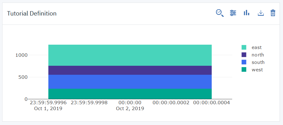
The chart is added to the dashboard display area, as shown in the following illustration.

Note: If you do not see your data, make sure that the dashboard's GroupBy option includes the record's execution date.
The data values and labels reflect the
valueobject in the record that you created in the last lesson. In the metric definition that you created in Lesson 2, you specified a bar-type chart in stacked mode. In stacked mode, the scale of the Y-axis is the sum of values. -
In the Tutorial Definition chart, click Chart type,
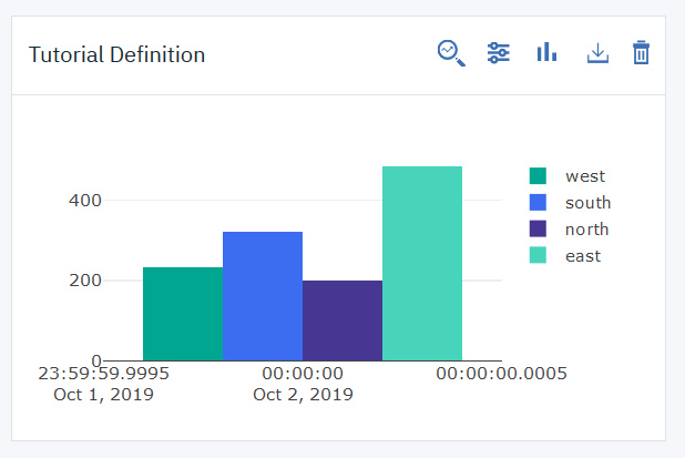
 , and then select Grouped bar.
The chart's Y-axis reflects the record's maximum value, as shown in the following graphic.

You can also select line-type for the chart, but, unless you upload additional records, that style is not very meaningful for the tutorial's single record. All charts can use the three types.
-
In the Tutorial Definition chart, click Filter,
 , and then select several values.
The chart displays graph elements for the selected values. Not all charts provide data filters, but when they do, as here, the chart filters work in tandem with the dashboard filters. Experiment with the filters and see how they affect the chart.
Results
In this lesson, you used the chart that you uploaded earlier to examine the metric data that you uploaded in the last lesson.
Typically, metric records are loaded into HCL Accelerate by plug-in integrations. In this tutorial, we demonstrated that it is easy to define metric types and load records by using a simple HTTP client. You might try uploading additional records to see how it affects the chart. How would you automate record delivery?
What to do next
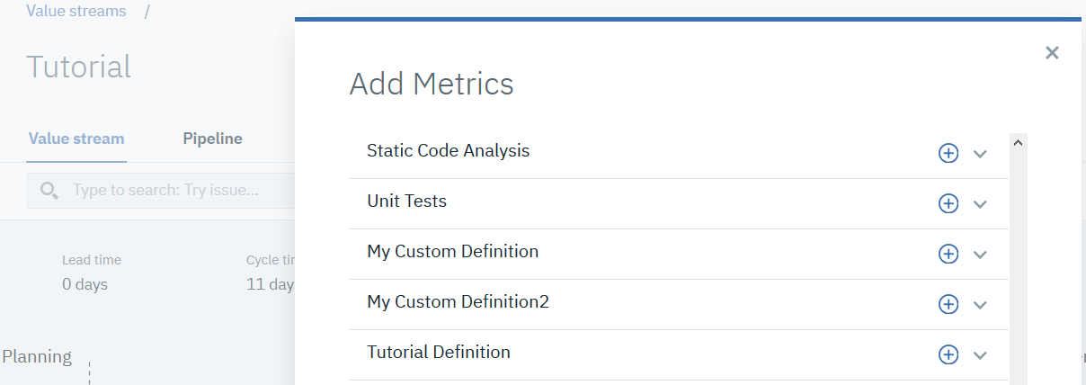
In addition to dashboards, metric data can be added to value streams. To see how this works, open a value stream and make sure that the Metric bar is displayed. Next, click Add a metric, 

Parent topic: Implementing custom metrics