Analyzing Insights data#
Managing Insights dashboards.
With Insights dashboards, you measure your organization’s progress and efficiency by applying analytic tools to your project data. Data comes from value streams, pipelines, HCL™ Launch applications, and other project areas. By default, all data related to the teams to which you belong are available. You set data scope by selecting built-in filters. You can set the scope by application, team, value stream, or some combination.
You can add charts to the dashboard from a large collection of DevOps chart types. Chart data is determined by the metric definition associated with a chart. When you add a chart to the dashboard, its graph area fills to reflect the filtered data. As you add multiple charts to a dashboard, the charts rearrange themselves to accommodate the new chart. When you save the dashboard, HCL™ Accelerate saves the filter and the charts that you used.
The dashboard workflow follows these general steps:
- Set the scope by defining a filter. You can scope data by team, application, or value stream.
- Set the search boundary.
- Add a chart to the dashboard.
- Customize the chart. You can change the chart style for all chart types. You can apply additional filters to some chart types, such as Deploy Count.
To manage a dashboard, complete the following steps:
-
On the HCL Accelerate Home page, click Insights > Dashboards, and then select the dashboard.
The dashboard page opens, which enables you to filter data, and apply charts.
-
In the Dashboard page, define the data scope by completing the following steps:
-
In the Filters area, select one or more filters.
By default, the data for all teams to which you belong populate the charts. You can restrict the data to a specific scope by selecting filters. Filters are available for teams, value streams, and applications. For example, you can restrict data to a specific team by selecting the team. Then the charts that you add will only contain data for the selected team. You can select more than one filter. HCL Accelerate teams and teams integrated from HCL Launch are available.
-
With the Calendar drop-down list to the right of the calendar,
 , set the search period.
The default search boundary is 90 days.
-
With the drop-down list to the right of Group By, set the x-axis coordinates for the charts.
The default x-axis coordinates represent days.
-
-
Click Add charts area and select a chart.
Charts for risk, quality, and delivery flow are available.
Note:
The chart is displayed on the dashboard. If the dashboard already contains charts, the new one is inserted in the top row. Data that matches the filter condition populates the chart.
Note: Depending on the filter and chart type, a chart might not contain significant data.
-
On the chart, use the Group By drop-down to set the data grouping.
The Group By function modifies the data presentation without changing the data.
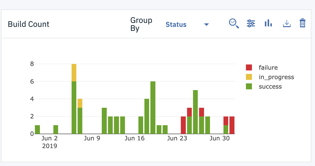
The following illustration shows a delivery flow chart, Build Count. Each bar in the graph represents the number of software builds for the specified coordinate, in this case days. The chart's Group By function is set to Status. A chart's Group By filter is determined by the metric definition assigned to the chart and might be unique to the chart. The chart's key displays the values for this grouping. This particular chart can also be grouped by name, requestor, application, and tag.
Note: Some chart types provide a default grouping that cannot be changed.
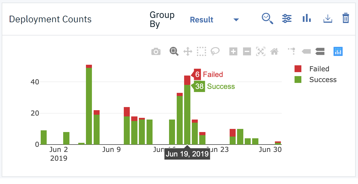
To see the breakdown of values for a grouping, hover the mouse over a graph element. The following illustration shows another delivery flow chart, Deploy Count. This chart is grouped by result. Hovering the mouse over a bar shows the results for the selected coordinate.
Note: For the Deployment Counts chart only, the choices in the Group By list are: Process name, Environment, Result, Type, User, Version, Application, Tag, and Team.
-
On the chart, click the
 drop-down to refine the data filter.
The chart is filtered, and the key is updated. The chart filter refines the data scope by applying additional filters to those you selected earlier.
Note: Not all chart types provide a chart-specific filter. For the Deployment Counts chart only, the choices in the Filter list are: Data set, Environment, Process name, Result, User, and Version.
-
On the chart, click the
 drop-down to change the chart type.
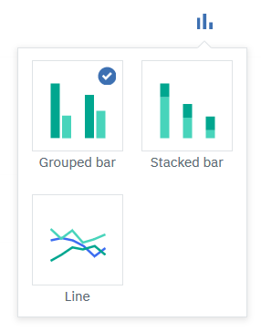
The types available are grouped bar, stacked bar, and line, as shown in the following illustration. The default type is Grouped bar.
-
On the chart, click
 , to download a comma-separated-values file of the chart's data.
 -
Click Save Dashboard.
HCL Accelerate saves your filters, charts, and chart customizations.
You can create your own metric definitions and upload custom data to HCL Accelerate. Custom charts are displayed in the Add charts area along with the pre-defined charts.
Parent topic: Managing Insights dashboards